
System Hike
—
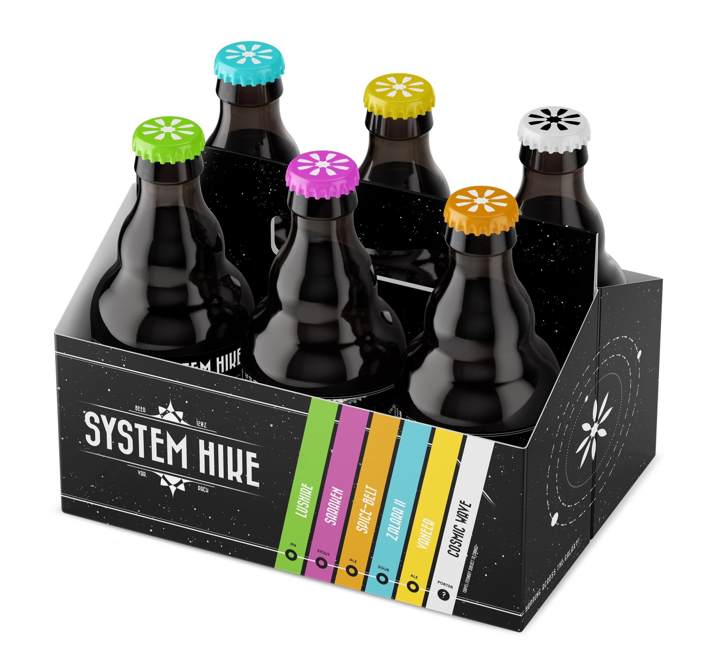
My Challenge was to create a personality-driven series of related beer designs that can be sold as individual units or bundled together in a package. Themed around a “world map”, the consumers plays a role a role in the adventure: To travel through a mysterious solar system to experience the flavors of different planets and cosmic sights.
Role: Design, Illustration

Challenge
—
My Challenge was to create a personality-driven series of related beer designs that can be sold as individual units or bundled together in a package. An added challenge was that I needed the The design follows Federal U.S. government regulations with proper, digestible usage of type, sizing, and verbiage.


Solution
—
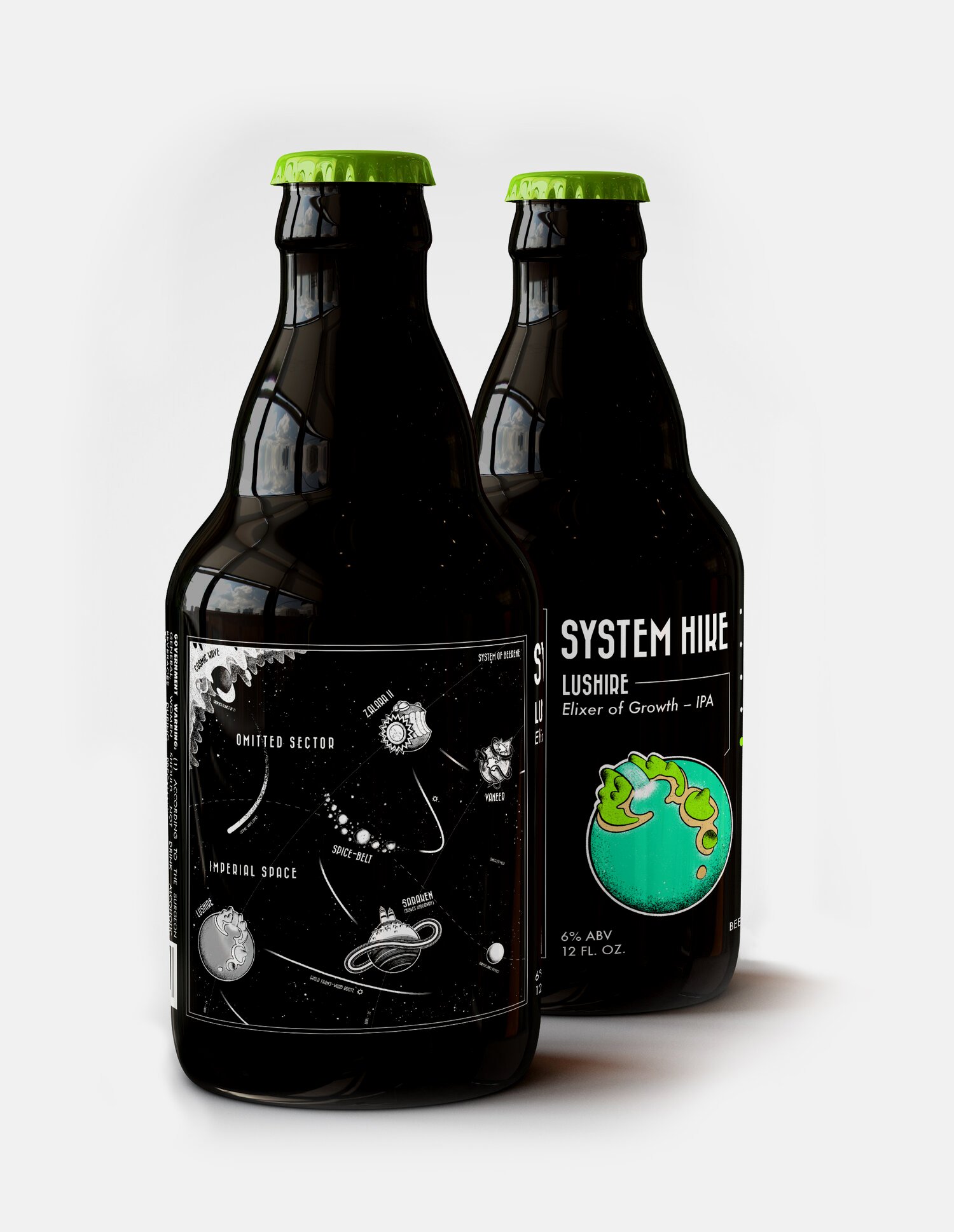
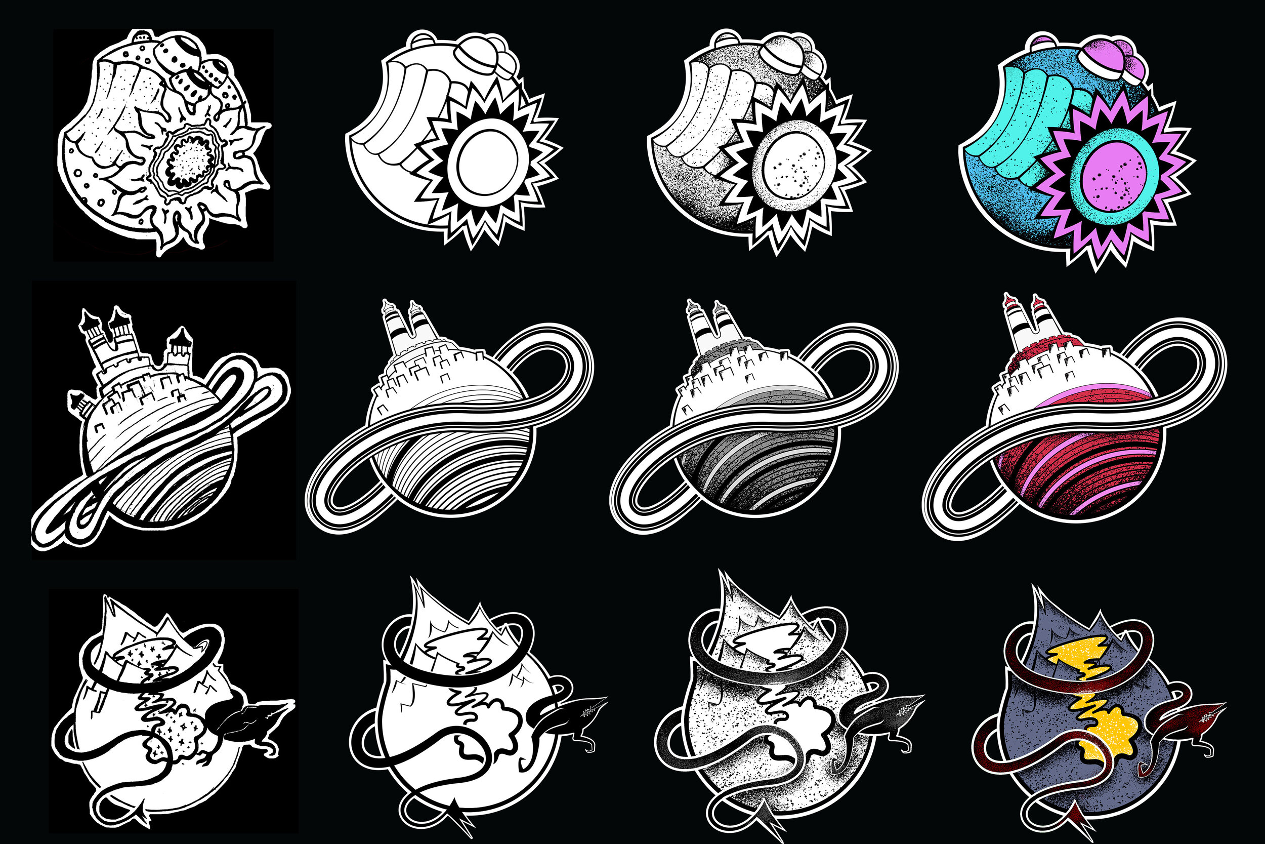
I themed the beers around a “world map”, the consumers plays a role a role in the adventure: To travel through a mysterious solar system to experience the flavors of different planets and cosmic sights. “Functional“ elements are contrasted with the illustrated elements of the map. Planets have stippled textures and color. The stippling gives the illustrations a more handmade appearance and The colors give personality. It should feel as if a cartographer drew this on their journey. Some travel poster illustrations were created to align to the space-hike theme and give personality to different planets.


Design, Illustration
Cole de Brito
Typography
Proxima Nova
Bazaar