
Giacomo
—
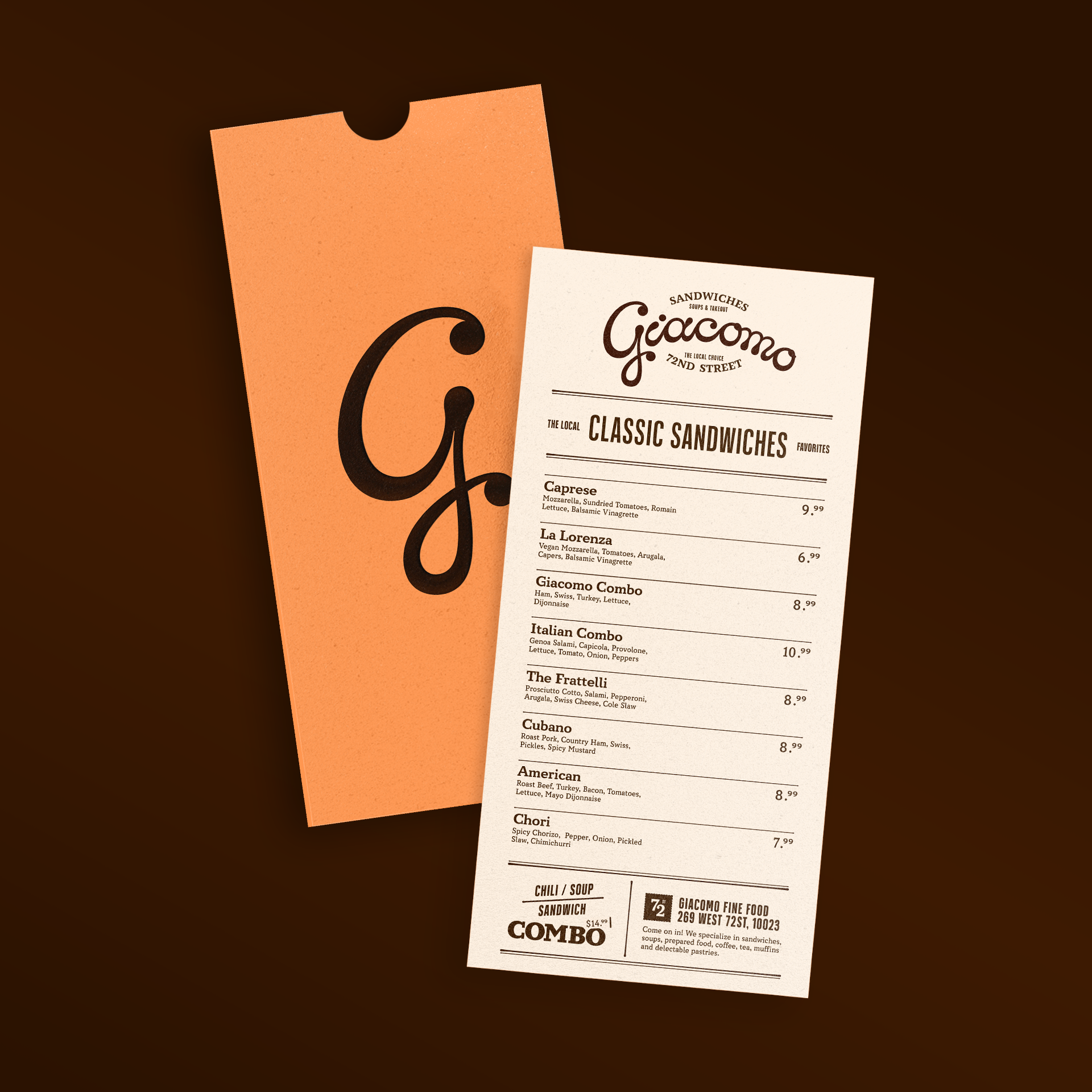
Giacomo Fine Food is a family-owned neighborhood food shop on New York City’s Upper West Side, offering an eclectic menu of sandwiches, soups, and pastries. This personal branding project explores how a small, no-frills establishment could be elevated through a cohesive visual identity while preserving its warmth, accessibility, and community-driven spirit.
Role: Design, Lettering, Motion, Copy
Challenge
—
Giacomo is known for its friendly, humble atmosphere and affordable, approachable food. The challenge was to design an identity that felt cohesive and elevated without losing its warmth or accessibility, balancing an artisanal sensibility with subtle Italian influence, while remaining grounded in the realities of a neighborhood food shop.


Solution
—
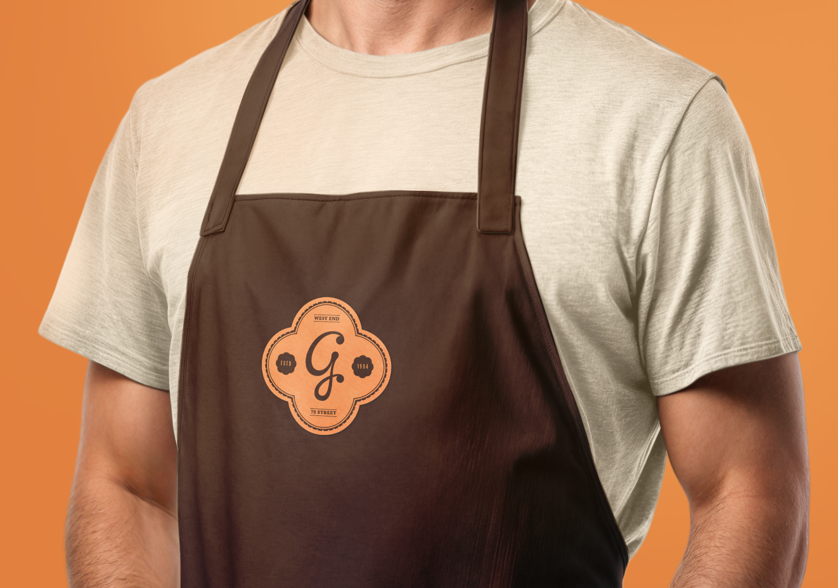
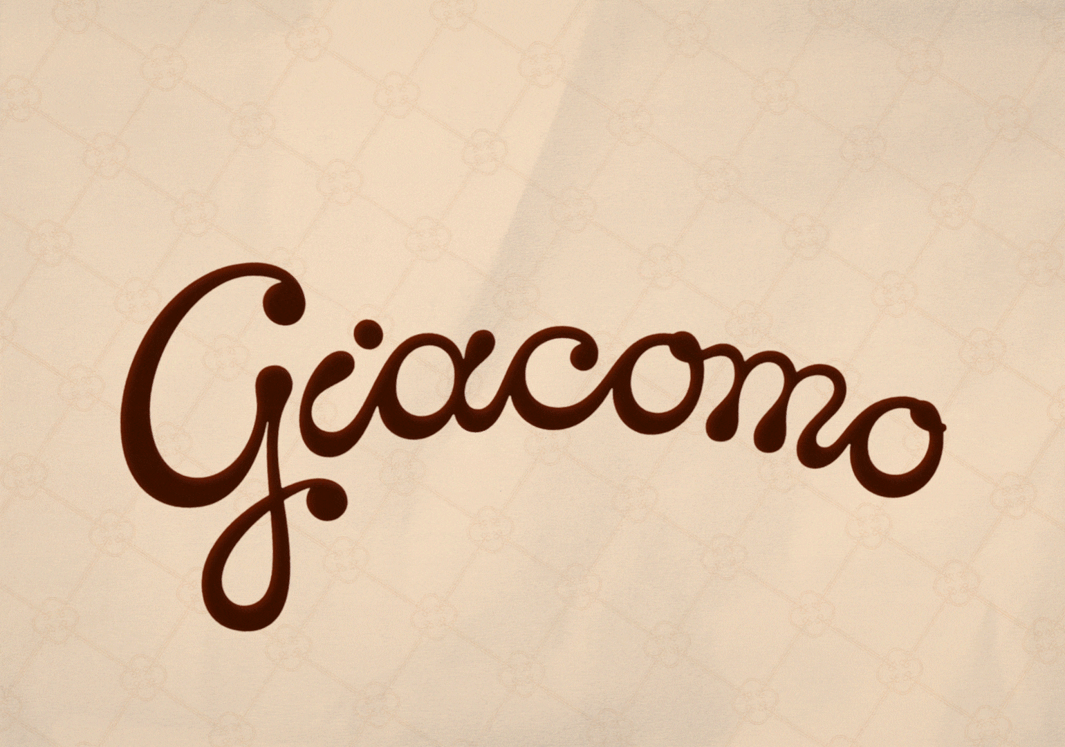
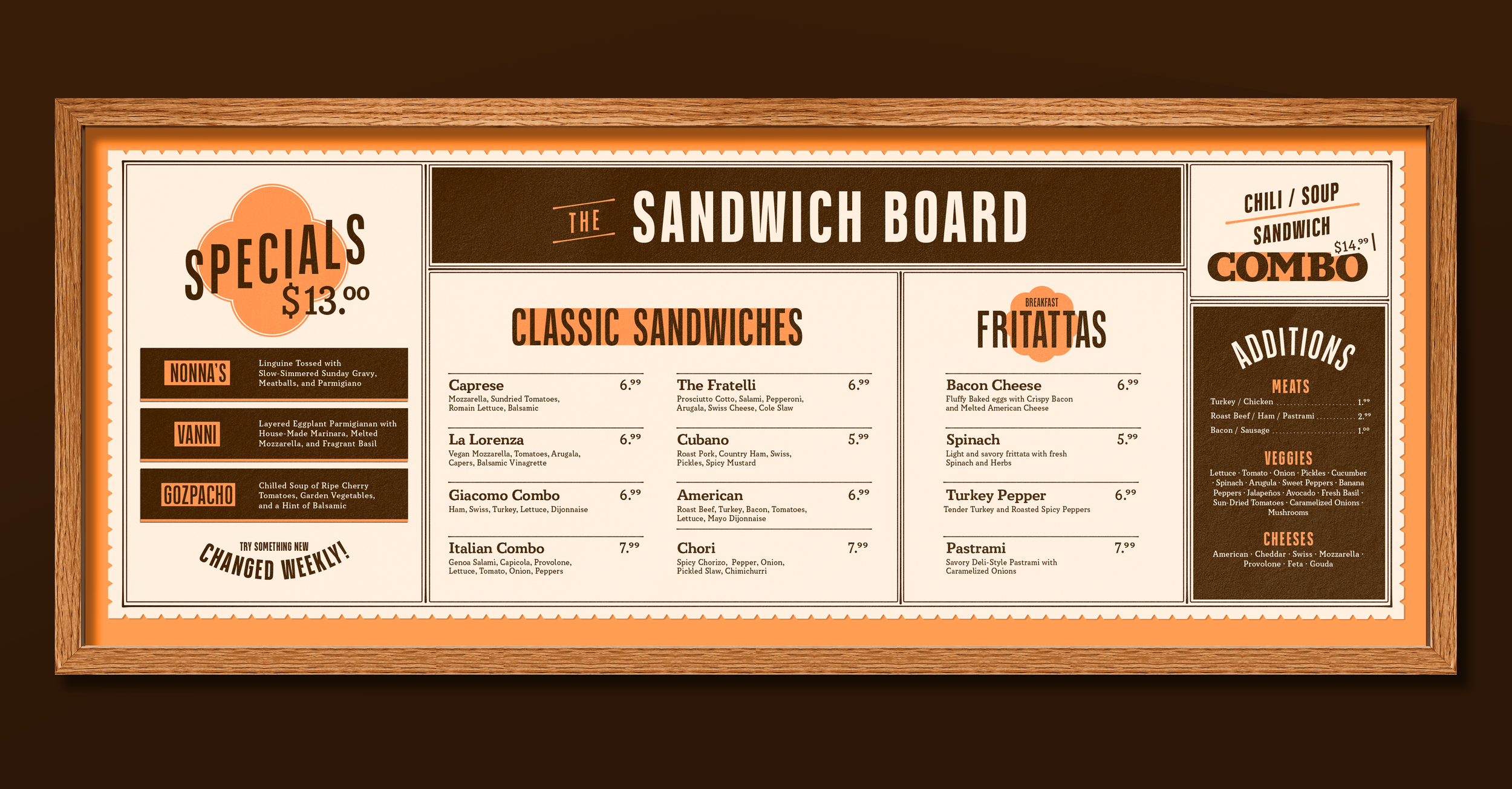
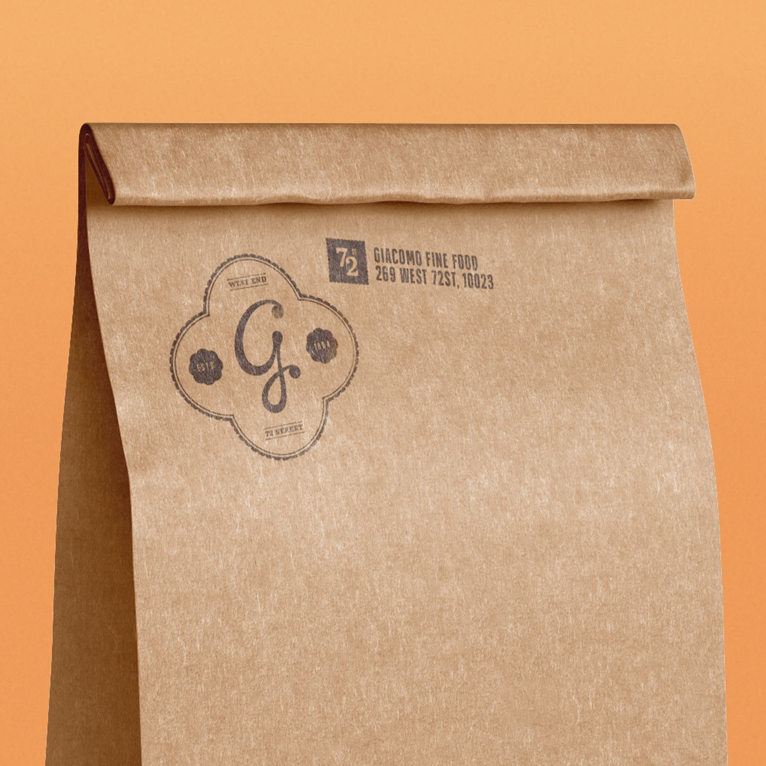
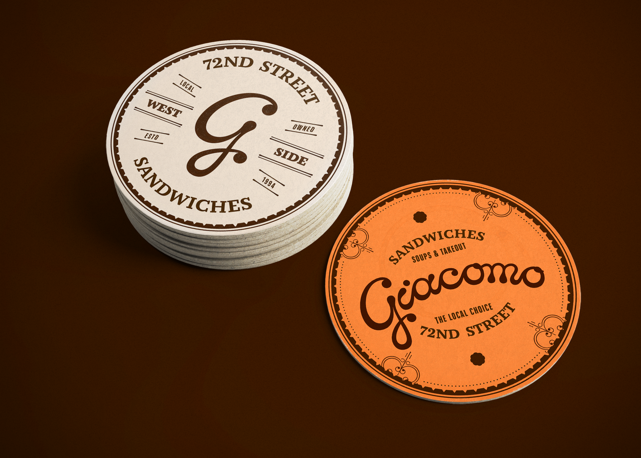
The Giacomo wordmark was custom-lettered in a flowing Italian-hand style to feel both friendly and traditional. Further rounded forms were paired with contrasting angular elements to introduce a sense of eclecticism reflective of the shop’s diverse menu. A warm, restrained earthen color palette reinforces humility and approachability, with the system designed to function across affordable one- and two-color print applications. A quatrefoil motif was introduced as a flexible pattern and container, referencing a worldly, timeless form that nods to Giacomo’s wide range of culinary influences.


Typography
Arteria Std Compress
Circe Slab
Design, Lettering, Animation, Copy
Cole de Brito